This quick guide will help you set up your first subscription form with the Easy Subscribe plugin.
After installing and activating the plugin, go to Easy Subscribe → Settings in your WordPress dashboard. Under the Form tab, you’ll find everything you need to customize your subscription form.
Most settings are straightforward, but we’ll walk you through the key options to help you get the form working just the way you want.
This documentation covers all available settings, including features exclusive to the PRO version. The Free version includes essential customization options and is fully functional out of the box, but the PRO version unlocks more advanced features and greater design flexibility.
Form
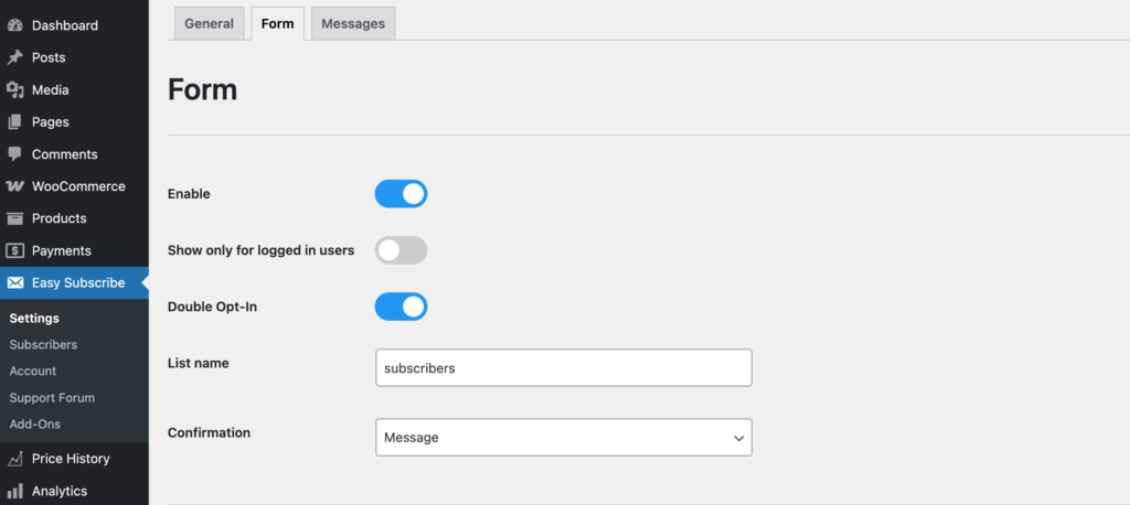
Enable
Must be checked to activate the subscription form. If disabled, the form will not appear on your site.
Show Only for Logged-in Users
Displays the form only to users who are logged into your site. Useful for private or members-only content.
Double Opt-In
Sends a confirmation email to users after they subscribe. They must confirm their email address to complete the subscription.
This helps prevent spam signups, ensures the email address is valid, and improves the overall quality of your subscriber list. It also helps you comply with privacy and email marketing regulations like GDPR.
Note: If a logged-in user subscribes, we assume their email address is valid and verified—so the double opt-in process is automatically considered complete, and no confirmation email will be sent.
List Name
Assign a unique list name. All subscribers who submit this form will be added to the specified list for easier management and targeting.
Note: The same email address cannot be added more than once to the same list. However, it can be assigned to multiple different lists.
This is especially useful if you’re running both a general newsletter and separate targeted campaigns—allowing the same subscriber to be part of multiple lists without duplication.
Confirmation
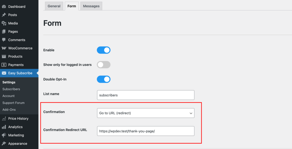
After a successful form submission, you can choose how to confirm the action to the user. There are two options:
Message (default):
Displays a confirmation message directly on the page. You can customize this message in the Messages tab.
Redirect to a URL:
Redirects the user to a specific URL after submission. This can be a thank-you page on your site or any external link. Simply enter the desired URL in the provided field.
Choose the option that best fits your user experience.
Automatic Form Placement
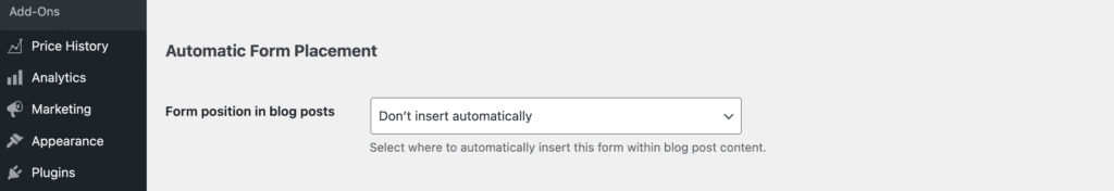
Form position in blog posts
This option controls whether and where a subscription form will be automatically inserted into your blog post content — without the need to manually add a shortcode.
Available Options:
- Disabled
The form will not be inserted automatically. You can still display it manually using the shortcode. - Before Content
The form will be inserted at the very beginning of each blog post, right before the main content. - After Content
The form will appear at the end of the post, directly after the main content.
Fields
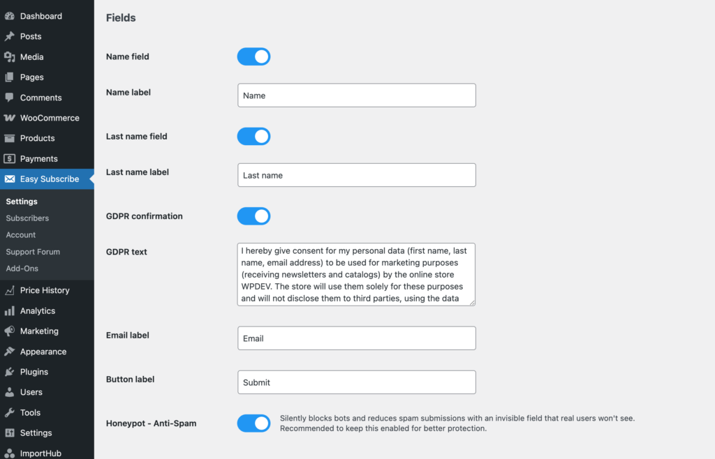
Toggle on the fields you wish to display on your form. Each field includes a customizable label or placeholder text.
Note: All enabled fields will be required—users must fill them in to submit the form. The Email field and Submit button are always required and cannot be disabled.
Name Field
Enable this to display the first name input. If enabled, you can set the label or placeholder text shown inside the field.
Last Name Field
Enable this to display a last name input. If enabled, set the label or placeholder text for the field.
GDPR Confirmation
Enable this to add a checkbox for GDPR or privacy consent. You can customize the text shown next to the checkbox.
Email Field
Always required and cannot be disabled. You can customize the label or placeholder text.
Submit Button
Customize the text shown on the form’s submit button (e.g., “Subscribe” or “Join Now”).
Honeypot – Anti-Spam
A honeypot is a hidden field added to the form to catch spam bots. Real users won’t see or fill this field, but bots often will.
If the hidden field contains any value on submission, the entry is flagged as spam and can be blocked.
This method helps prevent spam without disrupting user experience—no CAPTCHAs or extra steps required.
Design
Exploring the design options is best done hands-on. Use the Preview button in the bottom-right corner to open a live preview of your form.
This allows you to interact with the design settings in real-time and see changes instantly. Feel free to experiment until you achieve the look you want.
Once you’re happy with the design, don’t forget to click Save Changes for your settings to take effect.
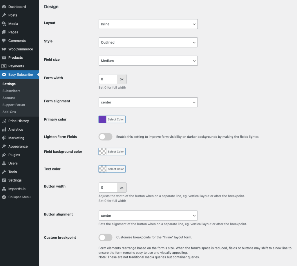
Layout
Choose how the form fields are arranged on the page. There are three layout options:
Inline
Displays all fields in a single line, if space allows. On smaller screens or narrow containers, it will automatically fall back to the Vertical layout.
Vertical
Stacks each field on its own row. This layout is clean, organized, and works well across all screen sizes.
Combined
Available only when all fields (Name, Last Name, Email) are enabled. Name and Last Name appear side-by-side in one row, while the Email field and Submit button each have their own rows.
Style and Field Size
You can choose from the following form styles: Default, Standard, Outlined, and Filled.
Select the size of the form fields: Small, Medium, or Large.
The best way to see how each style looks is by clicking the Preview button and switching through the options. This allows you to view the form in real-time and choose the style that best fits your site’s design.
Form Width
Set the maximum width of the form in pixels.
- 0 means no restriction—the form will use the full width of its container.
- Any other value (e.g., 400) will limit the form’s width to that number of pixels.
Form Alignment
Choose how the form is aligned within its container: Left, Center, or Right.
This setting only takes effect if the form width is smaller than the available space.
Primary Color
Sets the main color used for the submit button, form borders, and subtle shadows.
Lighten Form Fields
Enable this option to improve form visibility on darker backgrounds by applying a lighter style to input fields.
Field Background Color
Sets the background color inside the form fields.
Text Color
Sets the color of the text within the form fields and button.
Button Width
Controls the width of the submit button when it appears on its own line—such as in vertical layouts or after a responsive breakpoint.
- In inline layouts, the button width is fixed and adjusts automatically (usually around one-third or one-quarter of the form width).
- When the button drops to a separate row, this setting lets you define its width in pixels.
- Set to 0 for full-width, or enter a specific value (e.g., 200) to define a custom width.
Button Alignment
Sets the alignment of the button only when it is displayed on its own line (e.g., in vertical layout or after a breakpoint).
Has no effect in inline layouts where the button stays on the same line as the fields.
Choose Left, Center, or Right to control how the button is positioned within its row.
Use the Preview button to test different styles and find the best combination for your site.
Custom Breakpoint
Enable this option to customize how the Inline layout responds to different form widths.
Form elements will automatically rearrange based on the available space. This helps maintain readability and usability on all screen sizes.
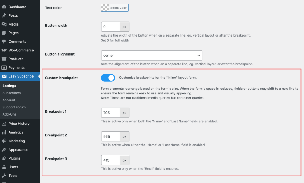
Note: These are not standard media queries—they are container-based breakpoints, reacting to the actual width of the form container.
Breakpoint 1 (Default: 795px)
Applies when both Name and Last Name fields are enabled. Controls when these fields stack instead of appearing side by side.
Breakpoint 2 (Default: 565px)
Applies when only one of the name fields (Name or Last Name) is enabled. Controls when it shifts to a new line.
Breakpoint 3 (Default: 415px)
Applies when only the Email field is enabled. Controls when the button drops to its own line for better spacing.
Before Form Text
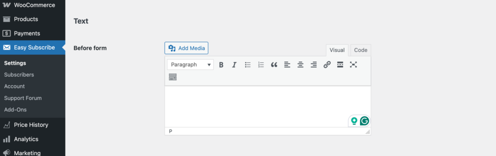
This is a WYSIWYG (What You See Is What You Get) editor field that allows you to add custom content before the form.
Use it to include a heading, short description, promotional message, or any other text or HTML you’d like to display above the subscription form.
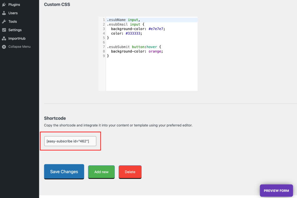
Custom CSS
If you need to fine-tune the appearance of the form beyond the built-in design options, you can add your Custom CSS here.
Note: The form is rendered inside a Shadow DOM, which is a special part of the browser’s DOM that isolates styles and markup. This means that standard CSS added through your theme or site’s stylesheet will not affect the form.
To apply custom styles, you must enter the CSS here—this ensures it’s included inside the Shadow DOM and properly applied to the form.
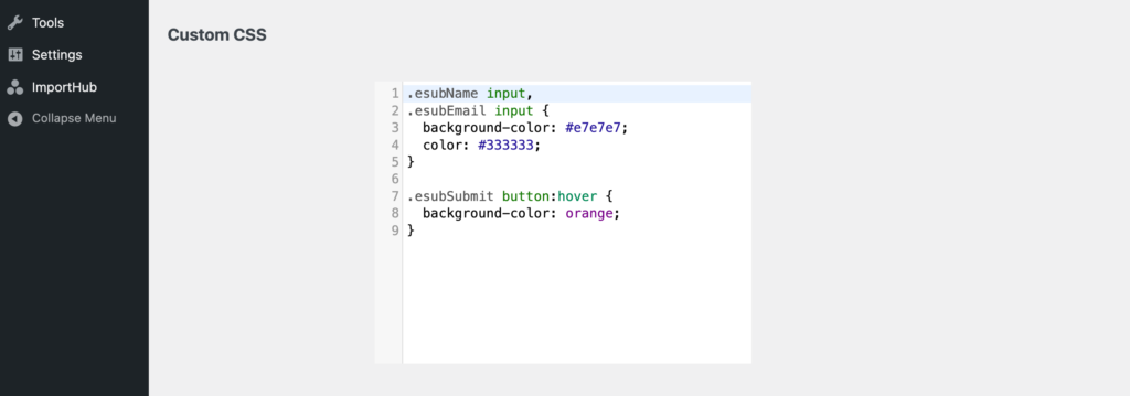
We don’t list available CSS classes here, as we assume that if you’re writing custom CSS, you’re comfortable inspecting the form and targeting elements using browser dev tools.
If you’re not sure how to do this, feel free to contact our support team—we’re happy to help!
Shortcode
Each form generated has a unique shortcode, conveniently located at the bottom of the Form settings page. Simply copy this shortcode and place it anywhere on your site.
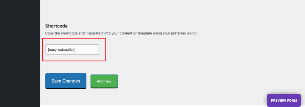
You can insert the shortcode directly into your preferred content editor, such as the WordPress block editor, Elementor, WPBakery, and others. Here’s an example using the default WP Block Editor:

Important Note: Please refrain from placing multiple forms on the same page, such as in the footer, sidebar, and page content. Only one unique form per page will be visible to ensure a seamless user experience.
If your website requires multiple subscription forms on a single page, we recommend considering an upgrade to our Pro plan for enhanced flexibility and additional features.
Adding Another Form
To create an additional form, click the Add New button at the bottom of the page. A new blank form will be generated.
Under the Easy Subscribe → Forms tab, you’ll see a subtab for each form. These contain individual settings so you can customize each form separately.
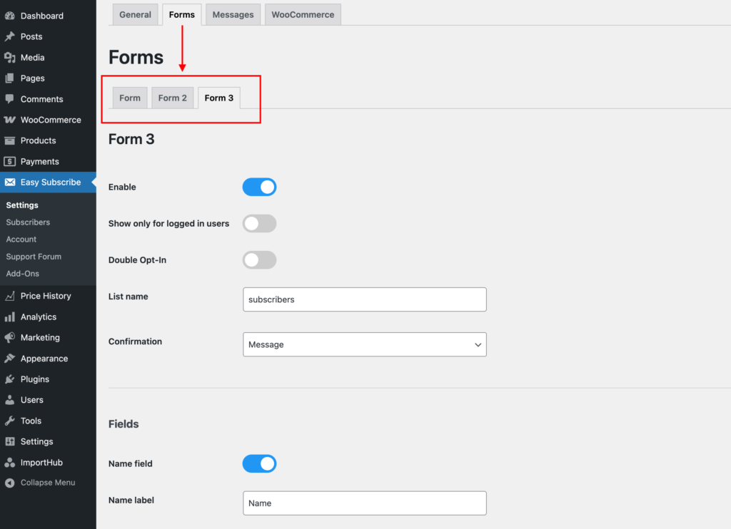
Each new form (except the first one) is assigned a unique auto-generated ID, which is used to target it via shortcode or display logic.