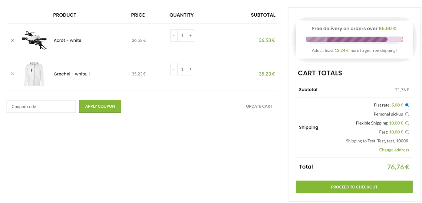
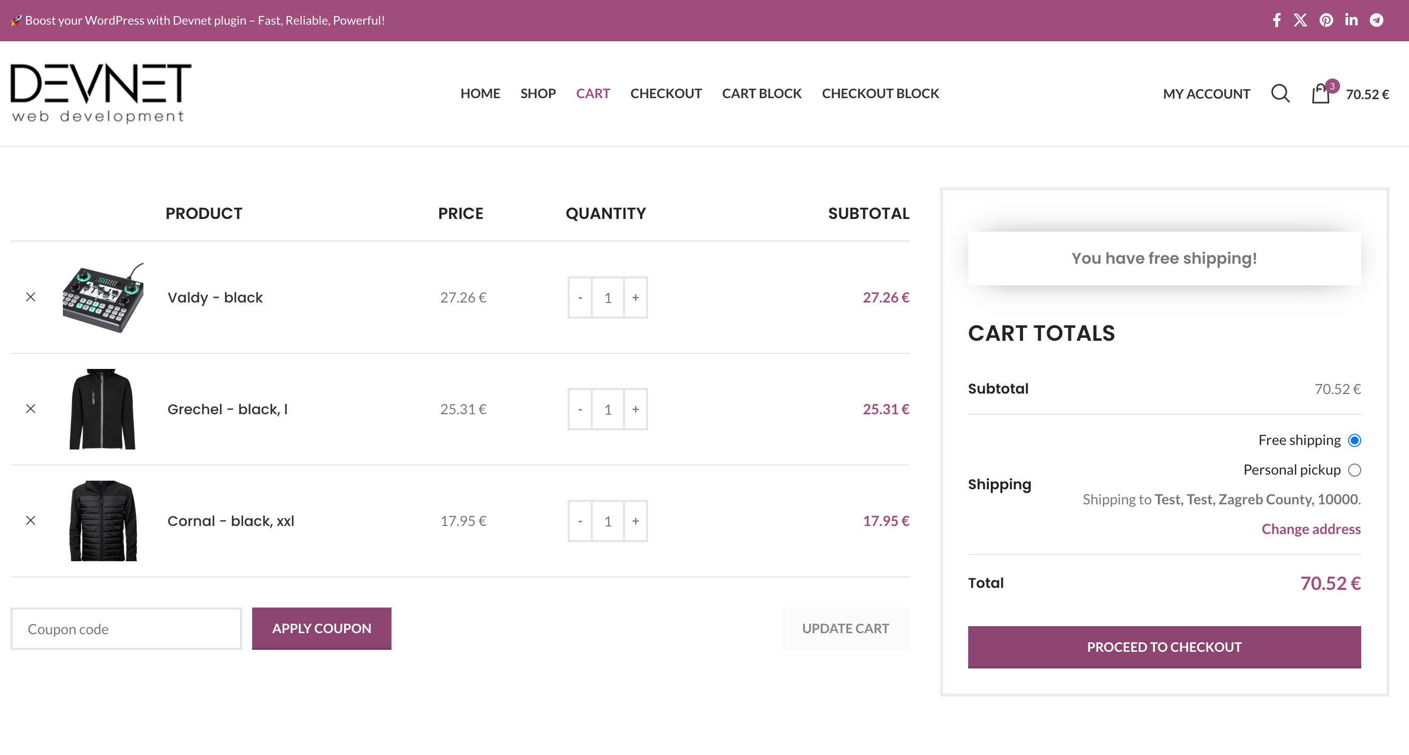
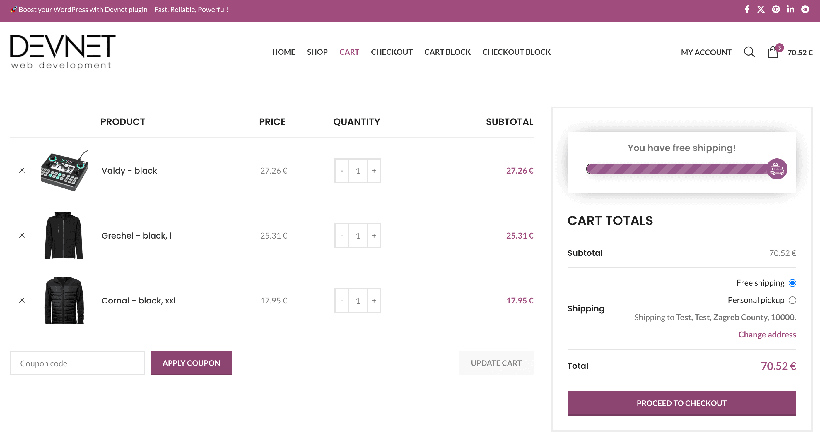
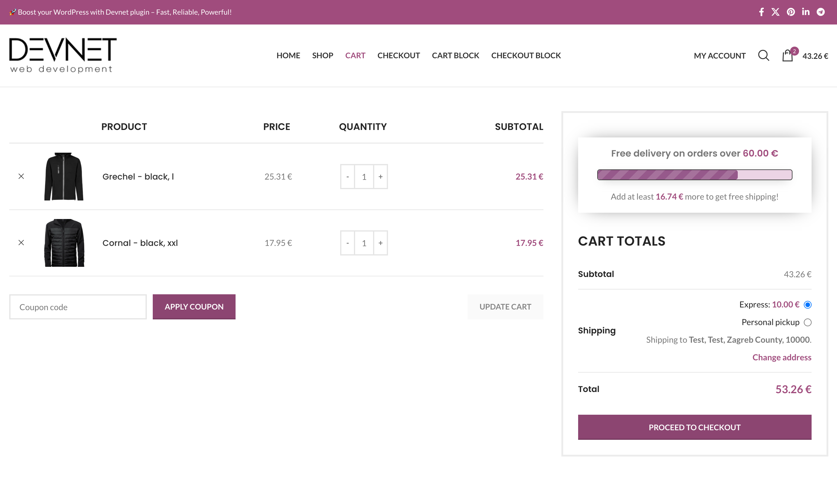
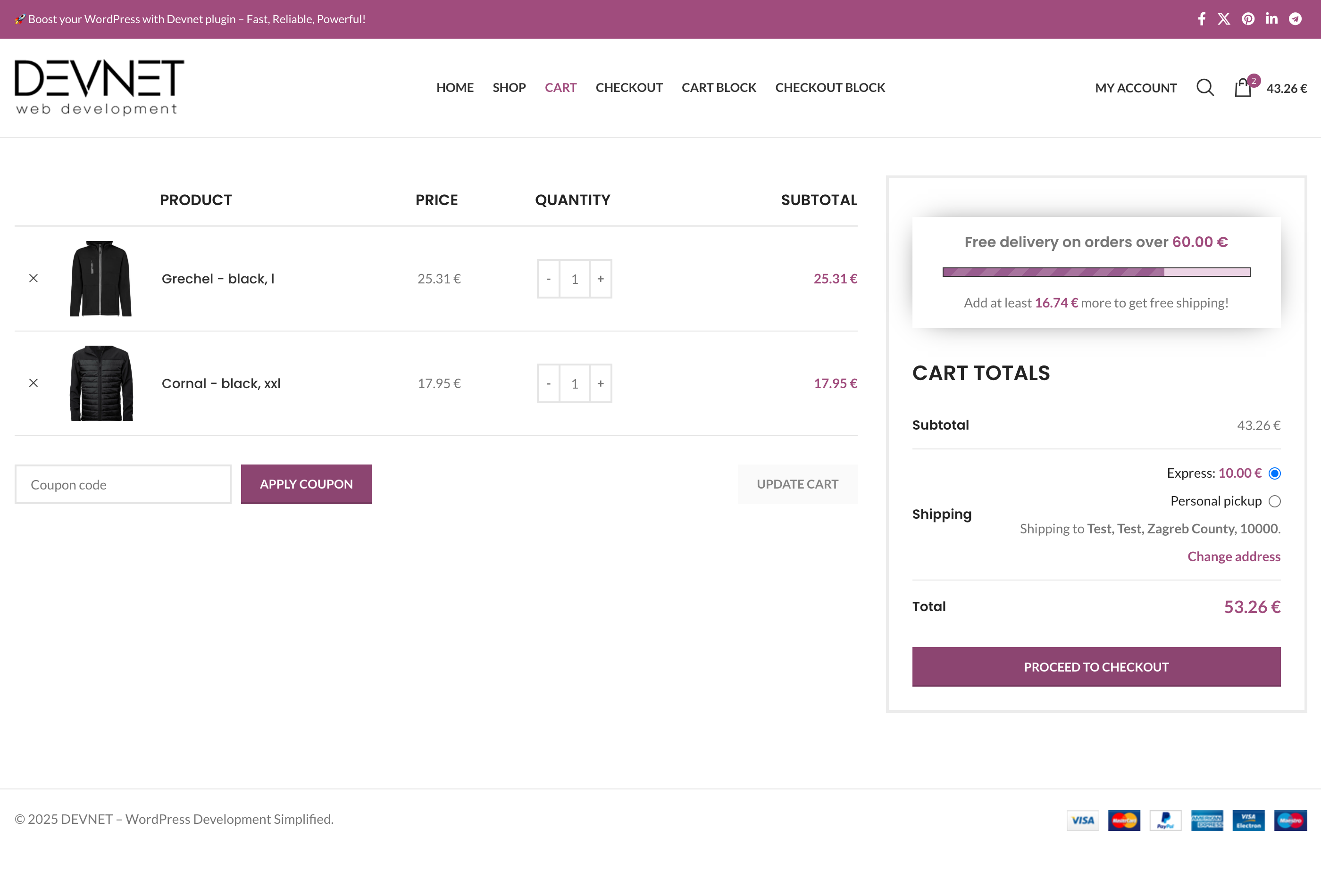
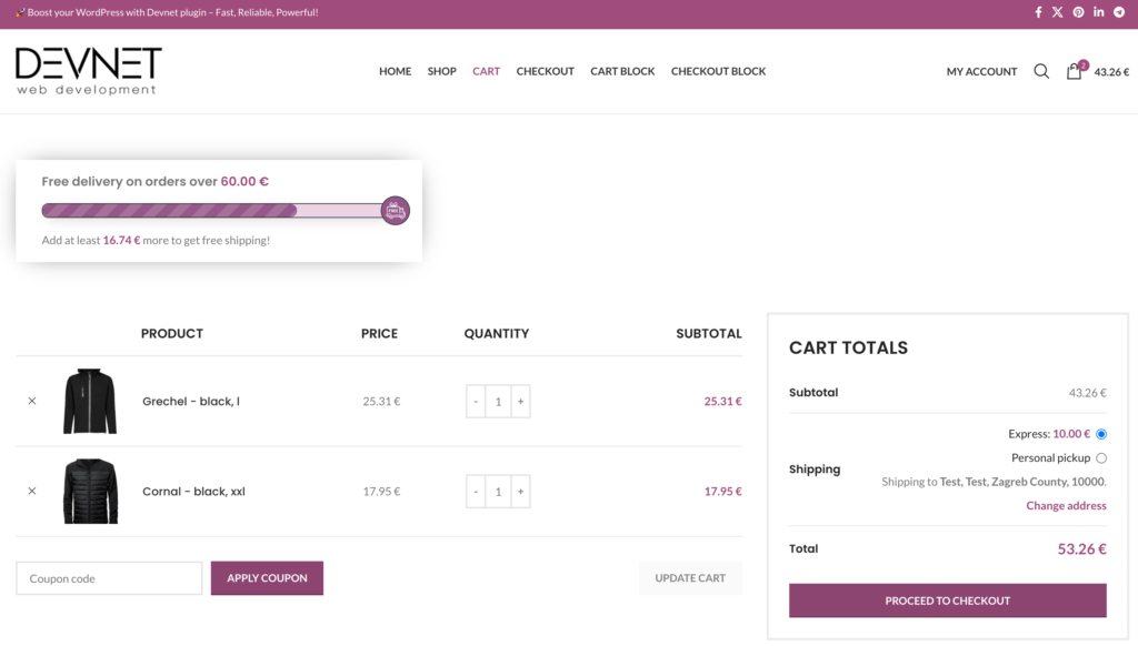
The free shipping progress bar helps customers see how close they are to qualifying for free shipping. This encourages them to add more items to their cart, increasing order value and boosting revenue.
The progress bar appears on the cart and checkout pages, as well as in the mini-cart widget, showing the remaining amount needed to qualify for free shipping.
Settings Page Overview
Let’s go through the settings and configure the progress bar to fit your store’s needs.
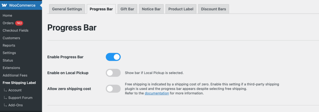
Enable Progress Bar
This option must be enabled for the progress bar to appear on shop pages.
Enable on Local Pickup
Displays the progress bar even when Local Pickup is selected as the shipping method.
Allow zero shipping cost
If a free shipping class is applied with a cost of 0.00, the plugin can either display a “Qualified for free shipping” message or hide the progress bar based on your settings.
Enable this option if you’re using third-party shipping plugins like WooCommerce Advanced Free Shipping, as they introduce their own zero-cost shipping methods that interact with the plugin’s free shipping detection.
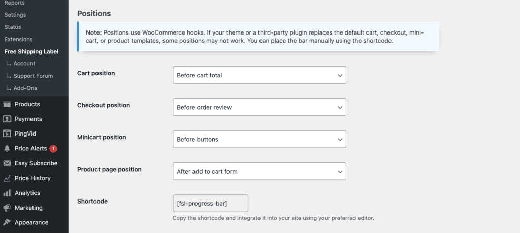
Positions
Choose where the progress bar will appear across your store.
Each section includes a position selector:
- Select a position to display the bar
- Select “Do not display” to hide it for that section
Note: Some themes are using fully customized cart and checkout templates and if they are not including default WooCommerce hooks, some of these positions might not work.
In such cases, you can place the bar manually using the shortcode or use your theme’s available hook/placement options. If needed, feel free to contact our support team.
Cart position
Controls where the progress bar appears on the cart page.
Choose a position from the dropdown based on where you want the bar to appear relative to cart elements (totals, buttons, or the cart itself).
Checkout position
Controls where the progress bar appears on the checkout page.
Positions are placed around key checkout elements such as the form, order review, payment section, and submit button.
Minicart position
Controls where the progress bar appears inside the mini-cart or side cart.
Depending on your theme, the bar can be placed before content, inside the cart, or near action buttons.
In the PRO version, additional options are available, including compatibility with popular cart plugins like FunnelKit, WPC Fly Cart, Side Cart, and Elementor. When a compatible plugin is detected, you can customize the progress bar position, such as at the top, above or below products, or above or below buttons.
Shortcode
To implement Progress Bar anywhere on the site, simply copy/paste the shortcode.
You can insert this shortcode directly into pages, posts, widgets, or page builders.
[fsl-progress-bar]You can also insert the shortcode via a hook into any template position that provides an available action. For examples, see the Developer Guide.
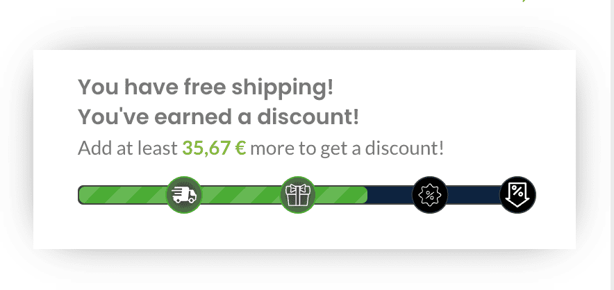
After Free Shipping Threshold is Reached
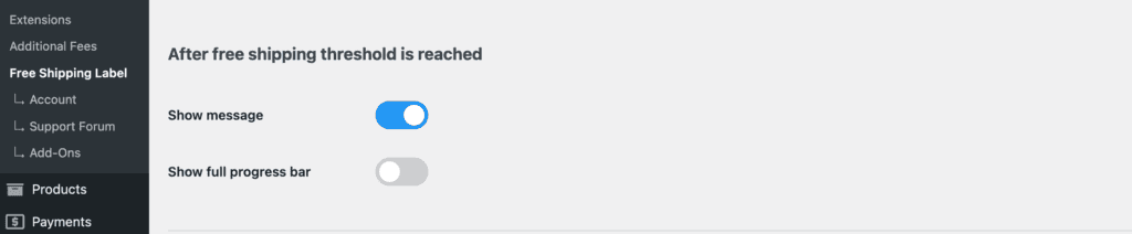
Once the free shipping threshold is reached, the Free Shipping Label plugin offers two options to enhance customer experience.
These options can be combined or used separately. If both are turned off, nothing will be displayed after the threshold is reached.
Show Message:
Displays a custom message indicating that the free shipping threshold has been met. Set the message in the Message after threshold is reached text field under the Text section.
Show Full Progress Bar + Show message:
Keeps the progress bar visible and filled to 100%, reinforcing that the threshold has been achieved.
Text
Translation to Other Languages: To enable translation, make sure the Multilingual option is enabled in the General Settings. See more at Translation page.
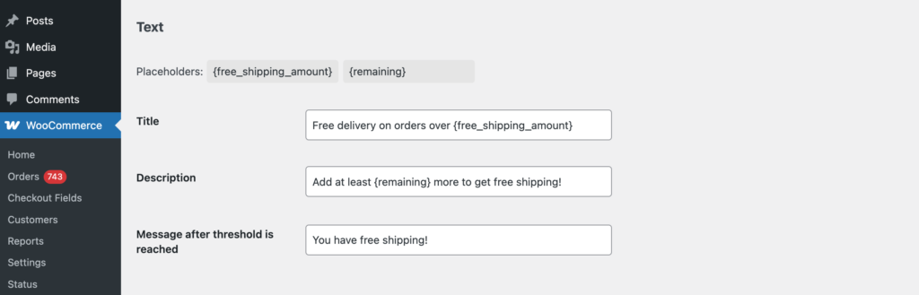
If this field is left empty, nothing will be displayed in this position.
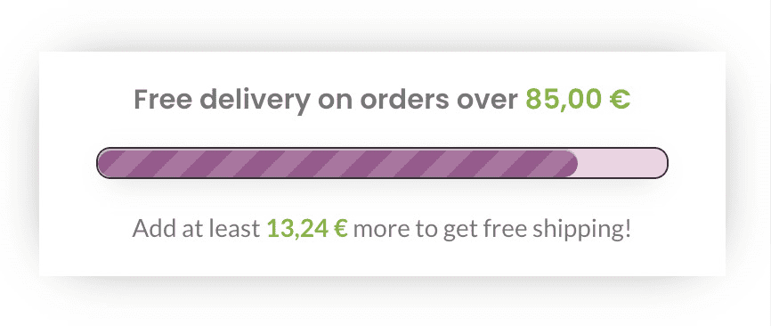
Title
Displayed above the progress bar.
Description
Displayed below the progress bar.
Message After Threshold is Reached
Shown when the free shipping threshold is met (if enabled). Customize the message to inform customers they’ve unlocked free shipping.
Placeholders
Use these placeholders to dynamically display shipping details:
- {free_shipping_amount} or {threshold}– Shows the free shipping threshold amount.
- {remaining} – Displays the amount left to qualify for free shipping.
Title and description text can be swapped as needed—placeholders will work in both fields.
Design
Customize the look and feel of the free shipping progress bar to match your store’s design.
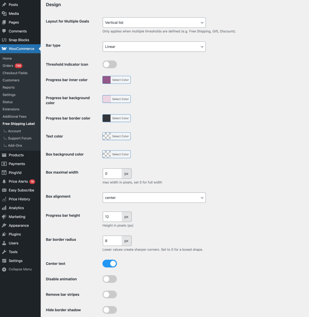
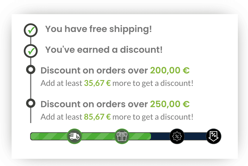
Layout for Multiple Goals
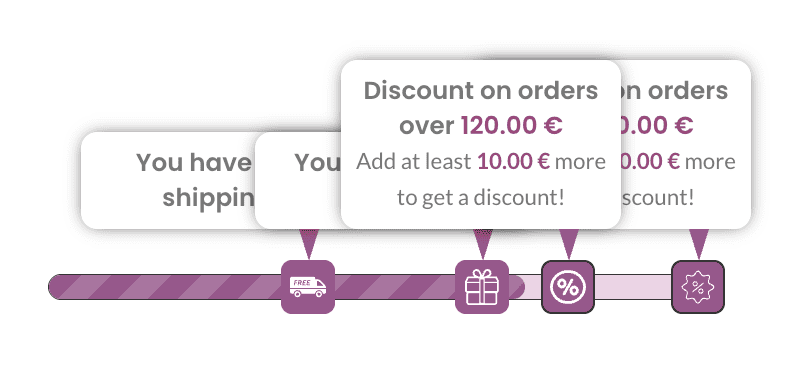
This setting controls how messages and markers are displayed when multiple thresholds are combined into a single progress bar — for example, Free Shipping, Gift Bar, and Discount levels.
You can choose from several layout styles to adjust how each goal is presented (e.g. stacked descriptions, minimal labels, or threshold bubbles).
This option applies only when all of the following are true:
- The Linear progress bar type is selected
- There are multiple thresholds defined (e.g. Free Shipping + Gift + Discount)
- The Gift Bar or Discount Bar is set to extend the existing progress bar
The Threshold Bubbles layout is available as an experimental feature. It displays small text bubbles above each milestone to visually highlight each threshold.
Use this setting to create a clearer, more engaging experience when multiple offers are active at once.


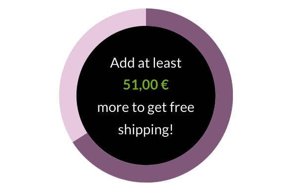
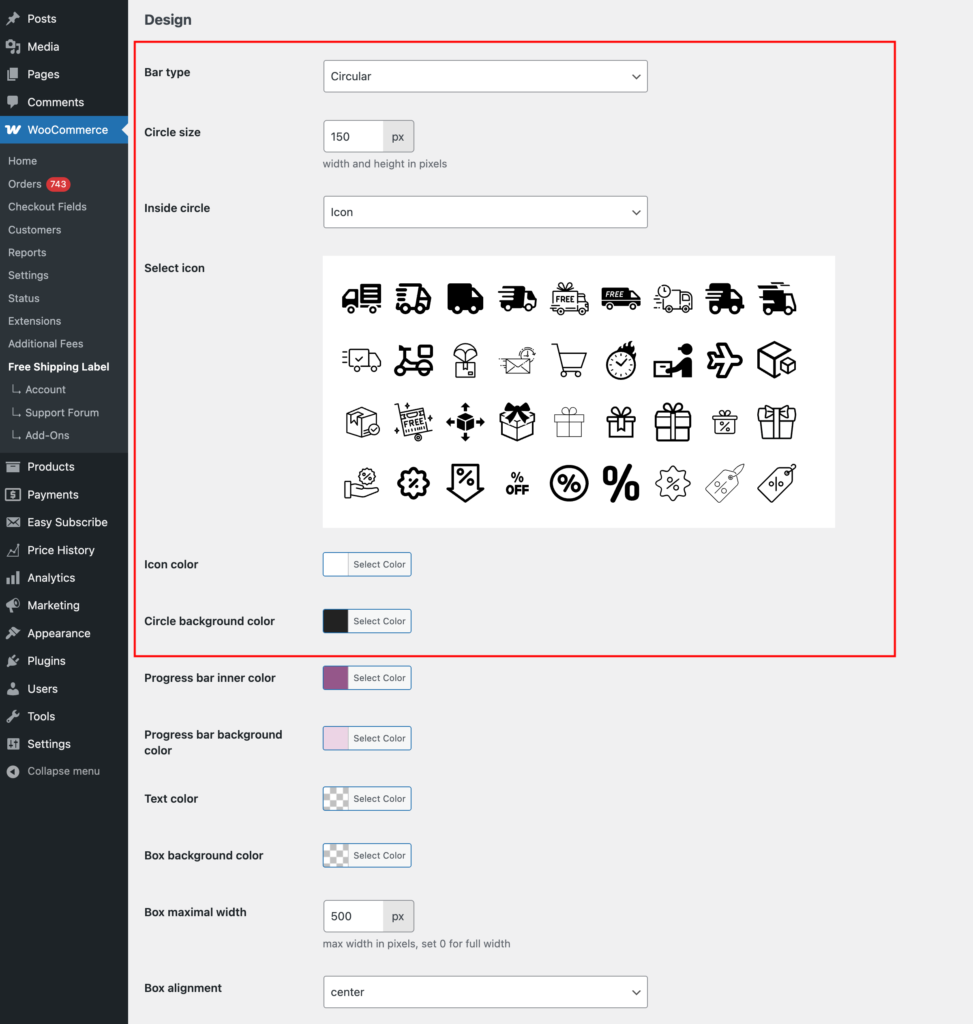
Bar Type
Choose the style of the progress bar:
- Linear – A horizontal bar that fills as the customer gets closer to the free shipping threshold.
- Circular – A round progress indicator for a more dynamic visual representation.
Linear Progress Bar
Linear Progress Bar Structure Overview:
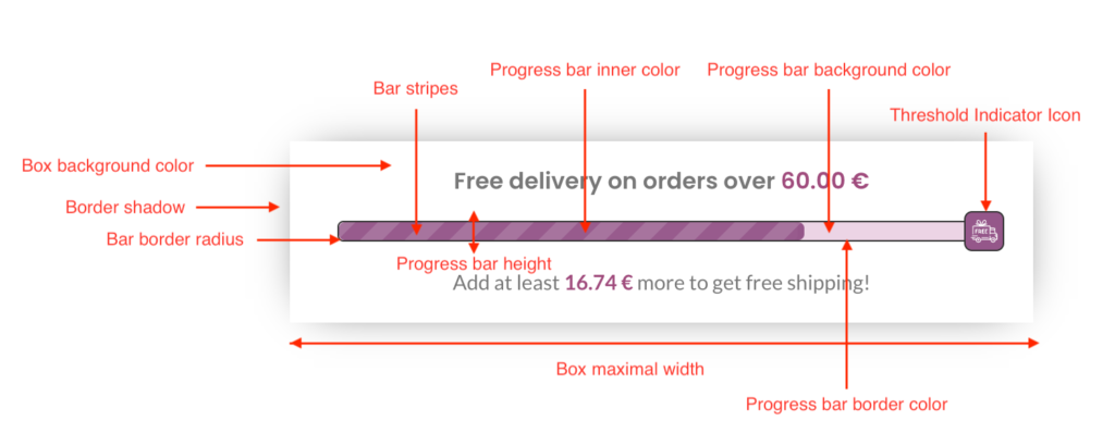
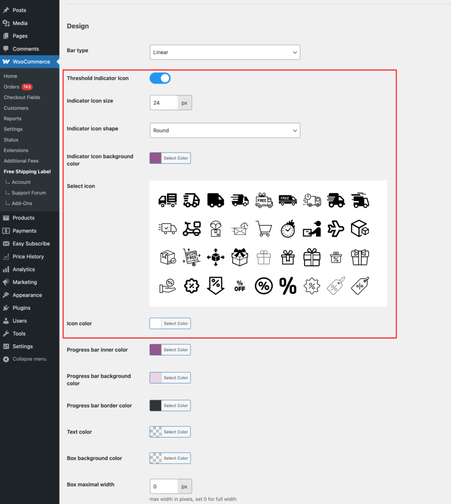
Threshold Indicator Icon
If enabled, you can set and customize an icon to mark the free shipping threshold. It will appear at the threshold position on the progress bar. If only the free shipping bar is active, the icon will be placed at the end.
Indicator Icon Size
Set the size of the threshold indicator icon to match your design preferences.
Indicator Icon Shape
Choose the shape of the icon:
- Round – Fully circular icon.
- Rounded – Softly rounded edges.
- Square – Sharp-edged square shape.
Indicator Icon Background Color
Customize the background color of the threshold indicator icon to fit your store’s style.
Select Icon
Choose an icon to represent the threshold indicator on the progress bar.
Icon Color
Set the color of the selected icon for better visibility and design consistency.
Progress Bar Inner Color
Set the fill color of the progress bar as it moves toward the free shipping threshold.
Progress Bar Background Color
Choose the lower color, underneath the progress bar, for better contrast and visibility.
Progress Bar Border Color
Customize the border color of the progress bar to match your design.
Text Color
Set the color of the text inside and around the progress bar for readability.
Box Background Color
Define the background color of the entire progress bar container.
Box Maximal Width
Set the maximum width of the progress bar container in pixels. Use 0 for full width. If the progress bar is placed in a wide section and appears too stretched, limiting the width (e.g., 500px) can improve its visual effectiveness.
Box Alignment
Align the progress bar container within its section: Left, Center, or Right. This is especially useful when Box Maximal Width is set, allowing you to position the progress bar within a wide section for better layout control.
Progress Bar Height
Set the height of the progress bar in pixels (px) to adjust its thickness.
Bar Border Radius
Adjust the roundness of the progress bar edges. Lower values create sharper corners, while 0 results in a boxed shape.
Example:
Center Text
Enable this option to center the progress bar text for a more balanced layout.
Example:
Disable Animation
Turn off animations for a static progress bar display.
If enabled, you can choose which animations to disable:
- All – Completely disables all movement effects.
- Shine – Disables the subtle shine animation.
- Moving Strips – Turns off the animated stripe effect while keeping the shine animation.
Remove Bar Stripes
Disable diagonal stripes on the progress bar for a cleaner look.
Hide Border Shadow
Remove the shadow effect around the progress bar container for a flatter design.
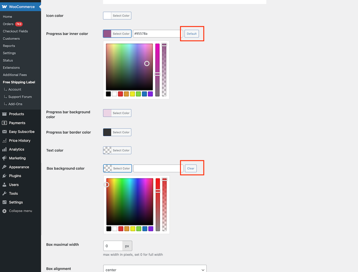
Resetting Colors to Default or Clearing Them
If a color has a default value, the button will say Default, allowing you to reset it. If the color can be left empty, a Clear”button will appear to remove the selection.
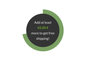
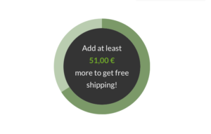
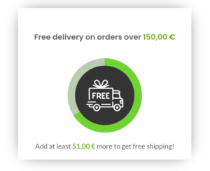
Circular Progress Bar
Most settings are the same for both Linear and Circular progress bars, but there are a few differences specific to the circular style, which we’ll cover below.
Circular Progress Bar Structure Overview:
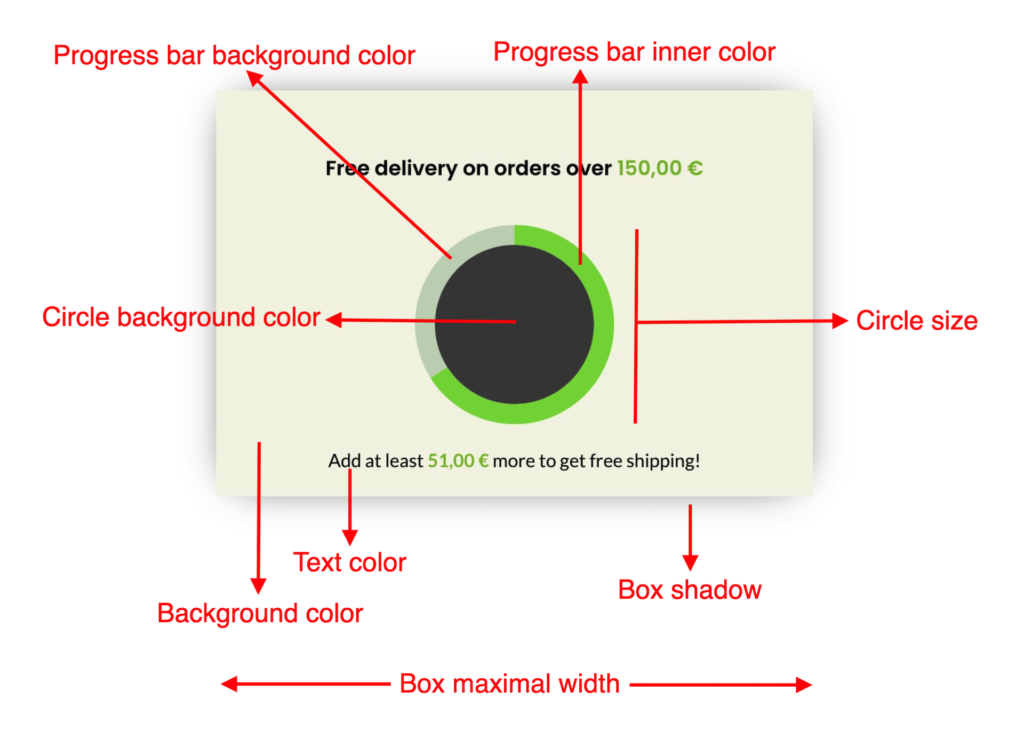
Circle Size
Set the size of the circular progress bar. The default is 150px, but you can adjust it based on the elements displayed inside the circle.
Inside Circle
Choose what to display inside the circular progress bar:
- Nothing – Leaves the circle empty.
- Title – Displays the title text from the text section.
- Description – Displays the description text from the text section.
- Icon – Displays an icon (icon options will appear if selected).
Select Icon
Choose an icon to be displayed inside the circle.
Icon Color
Set the color of the selected icon.
Circle Background Color
Customize the background color of the circular progress bar.
Examples
The circular progress bar can be styled in multiple ways. Here are a few examples.